Trading economics, a website that sits on top of an large economic data API, it has many moving parts from thousands of data points. Trading Economics analyzes and assembles this data together for economists, investors and enthusiast alike to synthesize snapshots of the global economy. Unfortunately, they did not have the users best interest at heart when building out there database and so the current experience of the site feels like scrubbing through a scattered dataset to gleam insights.
1. NAVIGATING THE HIERARCHY
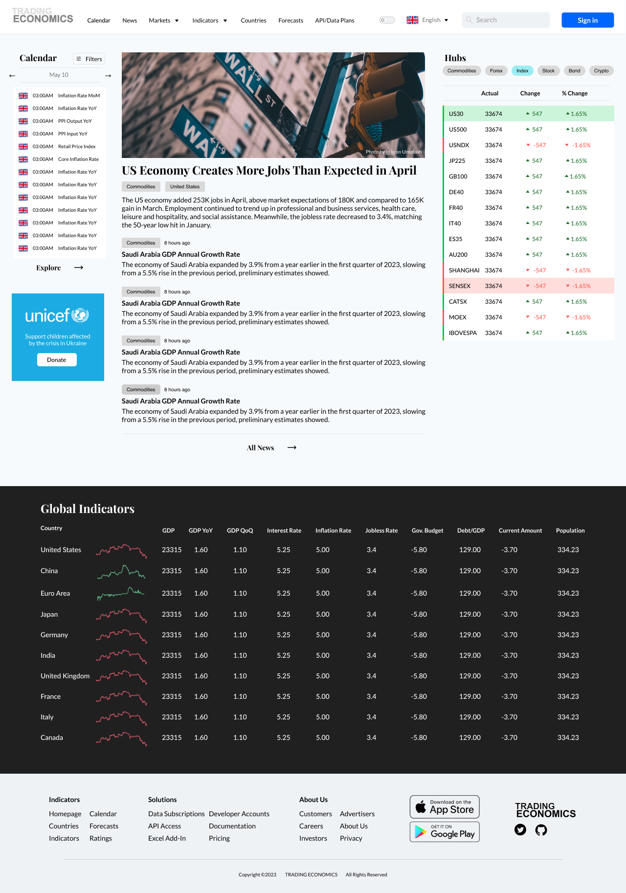
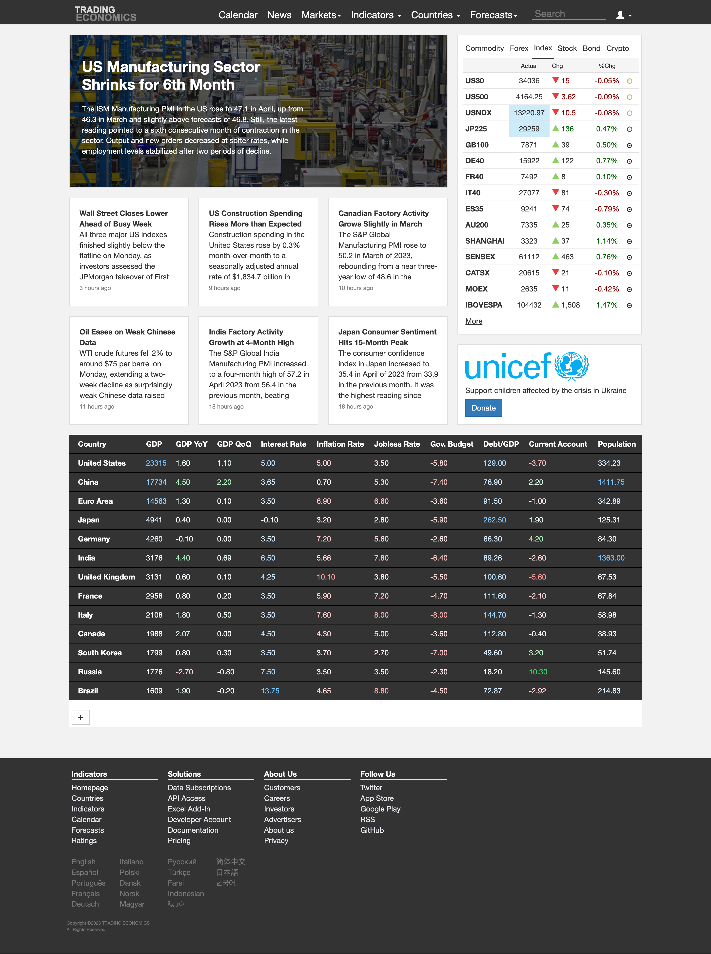
First, I needed to quantify the structure of the site. Establish an informational hierarchy, combing through the top level navigation and its sub-pages, I noticed that the majority of the content was placed under the ‘News’ section. This was not intuitive, the news items were listed on the homepage with no tags or date stamps to indicate relevance as is typical of newsfeed conventions.
Much of the inspiration for the news section on the homepage came from web3 sites that have constantly updating tickers and charts for crypto exchanges. These data heavy-sites still allow functional UI with the added benefit of industry news hooking the readers attention while occupying negative space with charts and rolling tickers. Decrypt.co was an influence of the final user flow.
2. REWORKING THE INDEXES
the Hubs Component is a cleaned-up version of the accordion that happened to be how the legacy Trading Economics added a quick-view of popular indices from within the platform. These are live tickers to show real time data, so I leaned on live ticker competitors such as Yahoo Finance and MarketWatch, they have highly visible color-coded increment/decrement shaders that overlays the data row. This would be more aligned with what financiers or investors are looking for. Increasing visual hierarchy and a rebalancing of the colors for better index comparison.
3. Navigational Improvements
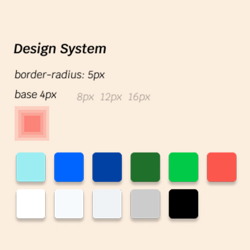
A design system was established for links to landing pages. The H2 font style was applied to differentiate from deep links that go to specific pages. Button hierarchy of primary, secondary and accordion (tertiary) buttons. Spreading out the color palette from those that I extracted from legacy site to a more expressive and distinct set of colors.
Second was to cover the individual data pages, US Non Farm Payroll for example is a data set that is released by FRED (Federal Reserve Economic Data) each month. This is where Trading Economics has its biggest value add, consolidating indicators with expert knowledge wrapped in a short consumable blurb to give context. This page consolidates data, charts, other calendar beats and analysts forecasts. Significant amounts of information to consume.
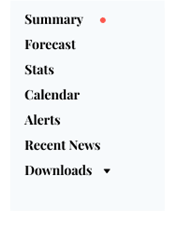
To enhance this experience, I pulled from the relatively new redesign to Wikipedia.org. In 2022 a revision introduced a sidebar that allow for quick navigation through lengthy articles that can be thousands of words long depending its depth and detail. This component add a sense of user control that will increase the power the user feels in navigating to exactly what information they can want and whatever order they choose to consume the page. Each section is a jumping off point to the sources themselves (also similar to the footnotes of Wikipedia.)
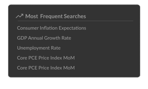
At this point I ran into the sheer scale of Trading Economics datasets, they pull from sometimes over 50 indicators from any given country that makes that data publicly available. So for the All Indicators component overlays the content and leads with suggestions for the user, so they feel confident that they can find what they might be looking for. This also has the added benefit of incorporating predictive search to span the entire list. This reduces the cognitive load for the user, not having to remember all of the common indicators released. I also added a separate dropdown for country control as well, since the lion’s share of the indicators will apply to multiple countries.
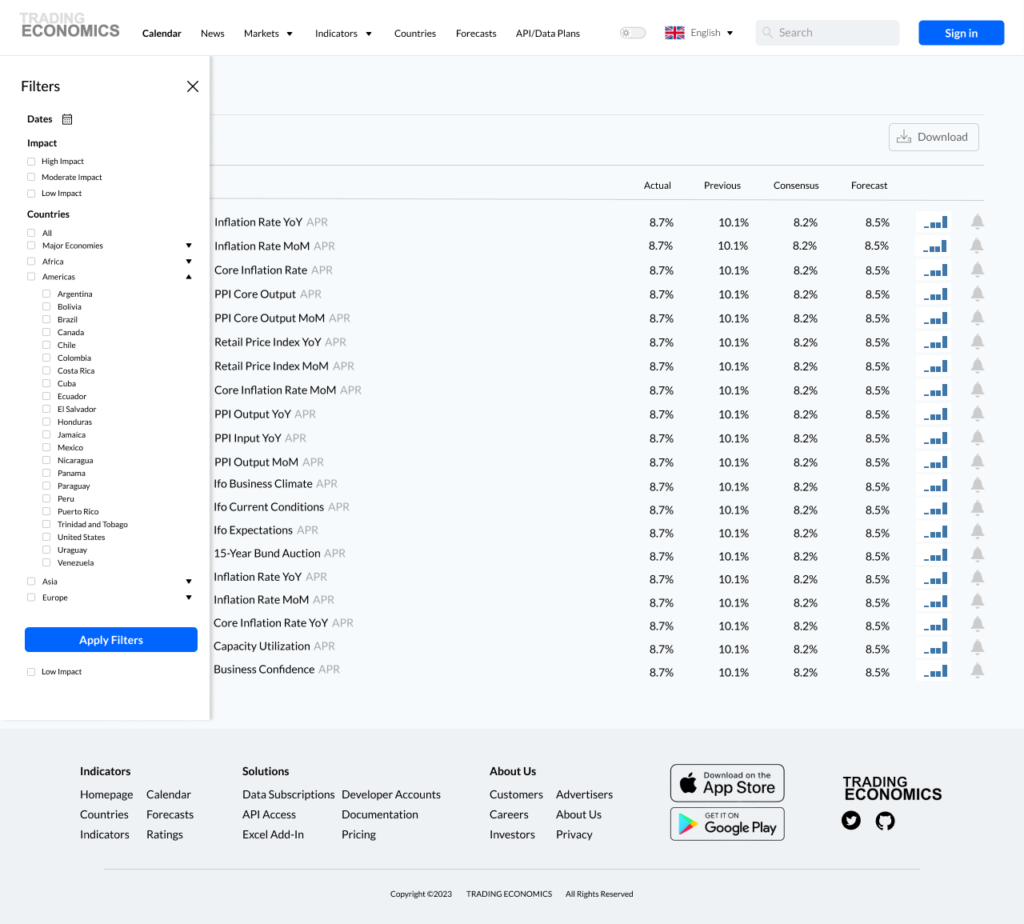
4. Calendar Filters
The Calendar section of the platform contains a large set of dates for any given month. With so many different governments releasing crucial data on a regular basis, I decided to improve the filtration system to sort it out. Instead of listing them out at the top level, I added them to a slide out tray that maximizes screen real estate for the data to populate. The previous iteration had a set of filters at the top left aligned to the content. However, the list of all nations publishing data is extensive and break the layout established from the rest of the page. I moved these over to dropdown with regional groups (Africa, Americas, Europe, and Asia), instead of a purely alphabet list of nations.
I also reimagined the Dates section as an actual date picker with range, a pattern that more users are familiar with rather than the presets that Trading Economics had established, which used not so concise language such as This Week, Next Week and Next Month.
On the News Section, I understand the separation that is engendered with the use of a Tabbed panel pattern. Each item filters between relevant news regarding the economy or markets. Unfortunately, the user is mislead by starting on the News panel, Isn’t it all “News”? My recommendation is to have “News” as static and the user has to option to toggle for the other Market and Economy sections in the articles listed below.
CONCLUSION
I, as well as many other curious investors or people just interested in economics, frequent Trading Economics’ site quite often. I consume this data constantly, but one does not get a sense of the true scale of a website like this unless one takes a long deep examination of the techniques that go into it.
Many websites perform by utilizing the platform’s API. This is why I wanted to take the time to analyze how the platform can improve its UX to lessen the cognitive load placed on the users, refine a few patterns, and consolidate the overall navigation to modernize Trading Economics and keep its competitive edge.